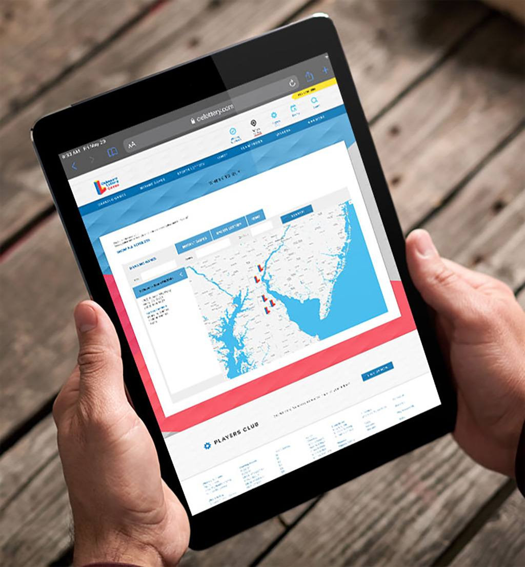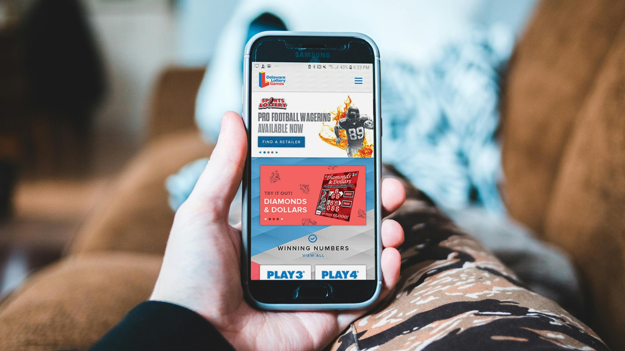
Better design. Better experience. A better DelawareLottery.com.
The Success
The new DELottery.com was a perfect example of style meets substance. The new site was clear and rooted in the lottery’s fun brand. But it also functioned in new ways. Games were better organized. Current and previous winning numbers were easy to find. “Similar games” encouraged cross-selling among players. And enhanced sections for both players and retailers made the site more of a destination, rather than a place to simply check winning numbers. And the results showed.
The Story
Offering hundreds of ways to win, the Delaware Lottery needed a new website that enticed new players to the lottery, while also keeping old players engaged and connected. Analytics showed that most visitors were looking for the winning numbers of their favorite games—quickly. While retailers, an underserved audience on the current site, needed their own resources, tips and opportunities for retailer-to-retailer engagement.
The Strategy
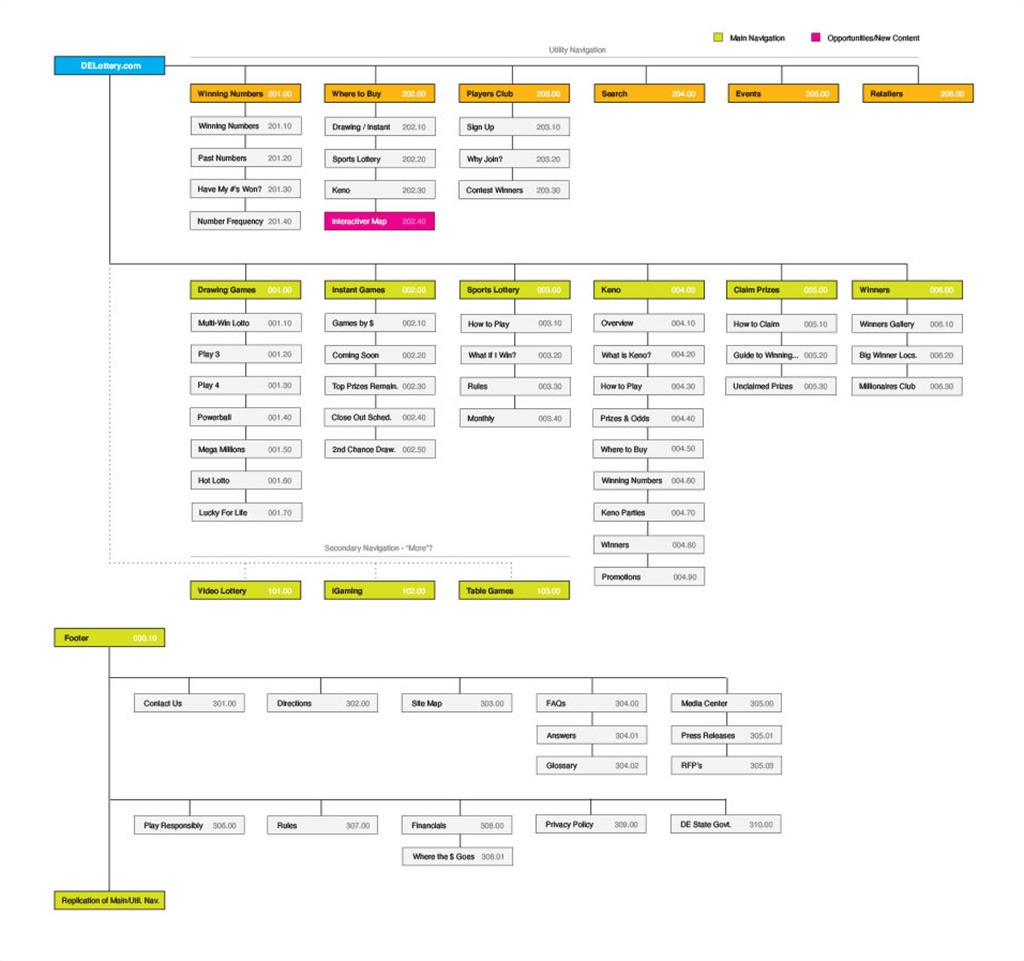
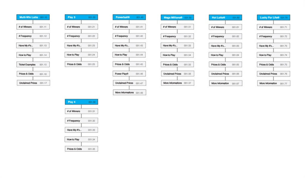
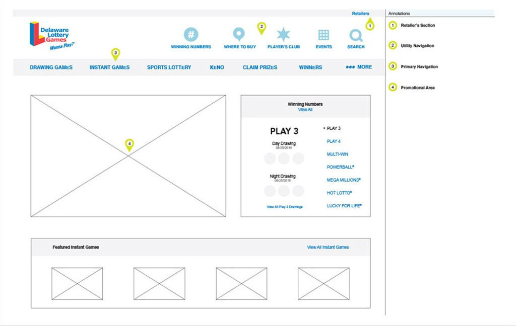
Aesthetically, the site was redesigned to exude the playful nature of the brand while also delivering necessary content in a quick and easy-to-read way. Careful consideration was given to winning numbers and game types, to make it easy for new and existing players to find numbers and new ways to win. Technically speaking, the site tied in with a number of back-end systems, databases and processes to keep the content live and always current. This way, a player would never miss a number. The site also did a great deal of heavy lifting by creating an archive of every single winning number in the history of the Delaware Lottery.
The Success
The new DELottery.com was a perfect example of style meets substance. The new site was clear and rooted in the lottery’s fun brand. But it also functioned in new ways. Games were better organized. Current and previous winning numbers were easy to find. “Similar games” encouraged cross-selling among players. And enhanced sections for both players and retailers made the site more of a destination, rather than a place to simply check winning numbers. And the results showed.
1 / 3
Results
new users
number of sessions
session duration
bounce rate