We're Branding Wizzes
&w=3840&q=75)
The Success
If Geno had any reservations about the new logo, they quickly disappeared when Philadelphia Magazine’s Foobooz editors pitted the old and new against each other, and asked readers to pick their favorite. The new logo won, hands down. But as it turns out, Geno didn’t need the opinion poll, because Geno’s family, staff and customers were very vocal about how happy they were with the new logo. It was so popular that it opened a new door for merchandising, with everything from tees and hats to signage, cups and sandwich wrappers displaying the new brand. Moreover, the 50th anniversary add-on was “golden” with the public and the media, and could even be seen in national stories.
The Story
If you know Philadelphia cheesesteaks, then you know the Geno’s Steaks story. Joey Vento built his South Philadelphia empire from a single location and on a single strategy: If you do it right, and it’s working for you, leave it alone. For nearly 50 years, that philosophy served Geno’s spectacularly. However, when Joey’s son Geno took over the business after his father’s death, he recognized Joey’s golden rule wasn’t working like it once did. As the business’s 50th anniversary approached, Geno took several carefully measured steps—including adding locations, developing philanthropic partnerships and leveraging social media as well as Geno’s “celebrity” customers and its position as the premier Philly sports restaurant—to put Geno’s in line with modern society and business strategies. What remained missing was branding that reflected this refreshed attitude.
The Strategy
AB&C approached the logo and 50th anniversary logo design knowing that everything about Geno’s was sacrosanct to its customers and the community. We had a legacy to protect, but also new leadership to assert. Our strategy was to evolve the logo instead of revolutionizing it—keeping the same color palette and boldness that is iconic Geno’s, and making adjustments that gave it a more modern, reader-friendly look and claimed the status of “Philadelphia Original.” We also took advantage of the short-term use of the 50th-anniversary logo to introduce something that drew immediate attention to the milestone, had a slightly more playful nature and emphasized what everyone loves about Geno’s.
The Success
If Geno had any reservations about the new logo, they quickly disappeared when Philadelphia Magazine’s Foobooz editors pitted the old and new against each other, and asked readers to pick their favorite. The new logo won, hands down. But as it turns out, Geno didn’t need the opinion poll, because Geno’s family, staff and customers were very vocal about how happy they were with the new logo. It was so popular that it opened a new door for merchandising, with everything from tees and hats to signage, cups and sandwich wrappers displaying the new brand. Moreover, the 50th anniversary add-on was “golden” with the public and the media, and could even be seen in national stories.
1 / 3
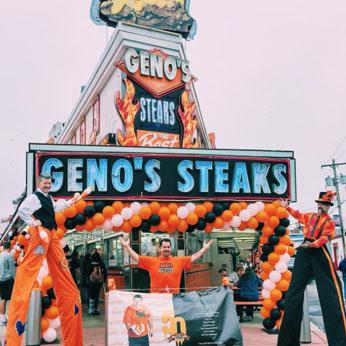
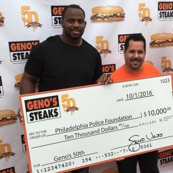
The “golden” 50th anniversary logo appeared on signage, cups, wrappers and at events throughout the city.
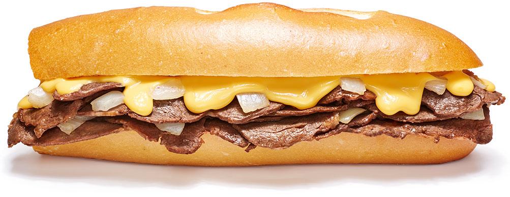


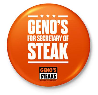
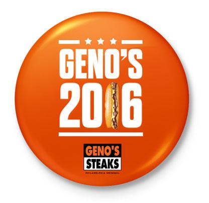
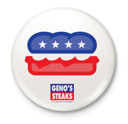
Buttons were created and passed out at the DNC to show delegates whose year this was.