
Color is all relative
 Though we all know about color — the ones we like and the ones we don’t like — color is often misunderstood. In certain combinations, colors can scream or whisper. This is because colors are influenced by adjacent colors. In our industry, designers understand how important color choices are. To the untrained eye, color choice — when not dictated by corporate graphic standards — may appear random. Far from it. We put a lot of thought into our decisions. Certain color combinations create harmony. Contrasting colors ensure the legibility of the message we’re trying to communicate. Colors are all relative — to each other. The difference between a message that’s screaming for attention and one that should be softer in tone can be achieved by which colors are used in the design.
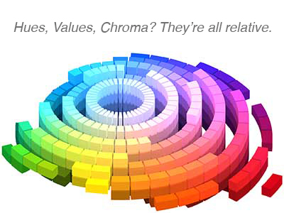
Designers work with color relationships every day. To develop the requisite skills, I’ve spent countless hours studying color theory and its applications. My program was based on the Munsell Color space, which categorizes a color’s relative hue, value and chromatic intensity. The projects we completed in this program required us to chart the colors we used in each assignment in this format. Now, this blog may not be the best way to explain color theory — but I did find an interactive site where you can explore these and other aspects of color. Check it out and get a glimpse of the process designers go through to make color choices.
Sign up to receive our industry trends newsletter: