Responsive images on the responsive web
 You’ve probably heard about “responsive web design” by now. Hopefully you’ve been able to incorporate this into any new web projects you’re working on, and you’ve already converted — or plan to convert — your existing high-value or high-traffic websites.
While responsive web design has been universally accepted and adopted, it does have a dark side: responsive images. I’ll explain what this problem is, how it’s being solved and why it’s yet another reason to let experts help you with these issues so you can stay focused on your content and ultimately your core business.
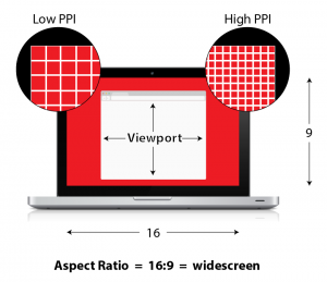
To understand the problem, we need to get a little technical. Here are some handy terms to know (refer to the diagram for some visual assistance):
Viewport refers to the overall size of your browser window. On your desktop, it’s typically very large, wider than it is tall and usually more than 1,000 pixels. On your phone, it’s typically much smaller, taller than it is wide and usually less than 800 pixels (often much less).
Aspect ratio is related to viewport; it’s the relationship between the width and the height of something (e.g., a computer screen or a photo). Technically expressed with two numbers like 4:3 or 16:9, it can also be generally referred to as “widescreen” or “portrait.” The aspect ratio of a typical laptop is “widescreen” while that of a phone is “portrait.” The aspect ratio of a typical snapshot is “landscape,” unless you turn your camera 90 degrees, in which case it is “portrait.”
Pixel density refers to the number of pixels that fit horizontally within an inch, often indicated in “pixels per inch” (PPI). (You’re probably familiar with “dpi” — “dots per inch.” This is OK, but better used for printed output.) The higher the PPI, the closer the pixels are to each other within that inch. The closer the pixels are to each other within that inch, the sharper the screen image appears to be. Once the pixels get close enough to each other, your eye can no longer distinguish between two pixels. Apple trademarked its high-PPI screen as the “Retina display,” but really any screen with a PPI greater than 200 can be considered high-PPI, and many phones, tablets and laptops have high-PPI screens.
Photo art direction is the design task concerned with determining how to size or crop a photo. Should it be a wide view showing the entire landscape? Should it be a portrait shot with a tight focus on the subject’s face? Should it show the speaker and the entire crowd or just the folks in the front row?
Browser support indicates whether a particular capability is available natively within a web browser. All web browsers have “support” for displaying photos. All browsers have “support” for displaying text at different sizes. Most browsers have “support” for changing the way these elements appear on the page based on your current viewport. (See how these definitions start to connect?)
All of this leads us back to the original topic: responsive web design. It simply refers to the technique whereby a website design will adapt itself to the viewport of your browser. You’ve probably seen this on any modern website if you change your browser size or if you view the same site on your desktop vs. a smartphone. Font sizes change, content is displayed in one or two or more columns, menus are shown entirely or are collapsed into a drop-down, etc.
Let’s talk about how these terms relate to displaying images, specifically photos, within a responsive web design.
Viewport is important because, depending on the overall browser size, the different components of a web page may need to adapt their size or position so they “fit” on the screen appropriately. It is viewport that primarily controls the mechanism of responsive web design.
While you do have to be careful, manipulating headlines, body copy, quotes, buttons, menus, etc., is relatively straightforward, and there are good techniques and good browser support to accomplish this.
For images, photos particularly, it’s a little tricky. Imagine you have a landscape photo with a widescreen aspect ratio. There is plenty of room to display it within the sufficiently wide viewport of a desktop browser, perhaps aligned on the right side of the page.
But what happens when that page is viewed on a smartphone with a decidedly portrait viewport? Do you want the photo to take up the entire width of the screen? That could work — but it might be too small to see the details. If you right-align it, will it be too small or leave enough room for the text? Should you re-crop the photo to fit the space better or to focus in on the main part of the image?
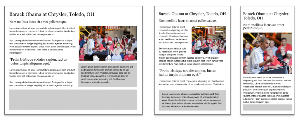
If you do nothing, you might end up with something like this:

On a desktop view (left), things look OK. On a tablet (center), the text is being squished by the photo, which is too wide. On the smartphone (right), you could argue it looks OK, but any designer would ask if you could get a tighter crop on the main subject.
Here’s another take:

The desktop remains the same, but the tablet view is displaying a version with a better aspect ratio of the photo so it doesn’t interfere with the text, and the smartphone version gets an appropriately cropped version, which uses the available screen space more effectively.
You can’t see it in these examples, but a related component is that the photo may not appear as sharp as it could if the device’s screen has a higher pixel density than the photo. This is the “blurry” effect you may sometimes see on your Retina iPad or other high-PPI device when looking at some websites (including this one!).
In short, the photo art direction we apply may need to change depending on the viewport of the visitor’s browser, and the pixel density of the photo should match the pixel density of the screen.
So, if we have good techniques and browser support for adapting elements in a web page based on viewport size (responsive web design), is there browser support we can leverage to adapt the art direction, aspect ratio and pixel density of the photo to match the device characteristics of the browser?
It turns out there is not good browser support to do this (yet). In fact, there is little to no browser support to do this and, without browser support, the techniques range from nothing at worst to inconsistent and complex at best.
We’ve covered a lot so far, so let’s sum it up: To display a single photo appropriately within a responsive web design, we need to take into account the user’s viewport and the pixel density of the screen to make available a photo that has a matching pixel density and an appropriate aspect ratio for the viewport, and is sufficiently art-directed so the content is understandable. And we need to do this with little to no support from the browser itself!
There is one last related element here: Sending the right image to the right device at the right time is good for performance. Send the appropriately sized image to a smartphone and it loads quickly, as opposed to sending the same, large image to all users, which takes longer to download and eat into your users’ data plans.
With or without browser support, because the viewport can vary wildly (even just from your smartphone to a tablet to a widescreen desktop display), you’ll need to break out a single photo into multiple images at various sizes. This ensures that normal images are available as well as high-PPI versions. And you’ll need to adjust the aspect ratios or cropping of some images to ensure the core content of the photo is visible within the space it will be displayed in. That’s a mouthful but it boils down to this: You might need to create six or more variations for a single photo.
How do we solve this problem?
That’s where it gets really complex. We won’t cover the details here but the short version is that there is no single way. Browser support is coming but it’s not finalized or even available as a test just yet. Any interim solution will need to adapt to the browser-supported version at some point. Most important, whoever is doing this better and sooner has an edge over the competition because his or her website will offer a more user-friendly experience.
We all want a website that is “user-friendly” often without understanding what that means or how to do it. One way is to display content, including photos, in a manner that honors the characteristics of the user’s device and network bandwidth. Responsive images can be a great way to do this, but you’ll probably need some serious help getting it done.
Sign up to receive our industry trends newsletter:
